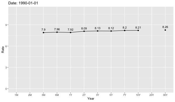
Visualising 28 years of US Treasury Yield Curve Rates
I saw the animated version somewhere on the interwebs and liked it. This is my take on it using ggplot and gganimate. Here, I am only showing a single curve per month in order to reduce the gif size.
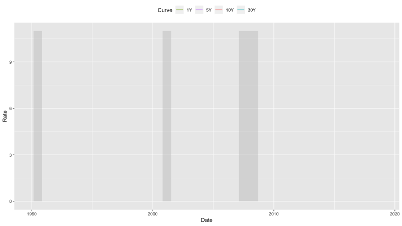
In this image, the recession periods are overlayed in gray color.