Gradients of the Network vol. 1
In this post, we visualize the filters of CNN trained on the imagenet. The are different ways to visualize the network, but we are going to focus on two:
- visualize individual filters of a single layer
- visualize the output of the entire layer(s)
But why do it? We think that by visualizing the filters at different layers we get a better grasp of what the filters have learned? What are the differences between the filters at various layers e.g how different is the filter at first layer from the one at last convolutional layer? And, my personal favourite, it allows us to create some really fun psychedelic visuals (generative art).
Filter visualization
During the training phase of the Neural network, the weights are learned/updated in order to bring the predictions closer to true labels. For filter visualization, we keep the filter fixed and modify the input image such that it maximizes the filter output. The libraries such as Keras make is very easy to implement such techniques. Let’s break down the process.
- Start with a pretrained model, VGG16 trained on imagenet in our case
- Keep the convolutional layers from the model and discard the dense layers as we want to visualize the filters
- Choose a layer and filter to visualize and use its output as loss function
- Get the gradient of loss with respect to the model’s input
- Change the model’s input using gradient values to minimise the loss i.e bring the input closer to filter output
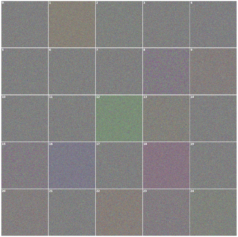
Let’s take a look at the first 25 filters of all VGG16 conv layers. Each layer builds upon the previous and detects increasingly complex structures. The initial layers detect colors and edges, the subsequent layers detect textures and the top ones detect shapes such as eyes, nose or faces.
Layer visualization
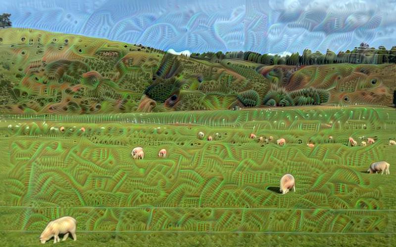
This approach is known by a popular name DeepDream that was developed by Mordvintsev et al from Google. It has two parts to it: 1) the approach to create the layer visualization 2) letting the network dream/hallucinate
The layer visualization approach is similar to the filter visualization but here we use the output of the entire layer in our loss function and model’s input is generally an image instead of noise image. Let’s call it the layer visualizer function, it takes an image and layer name as input, runs gradient descend to minimise the loss function and returns the modified image. In order to get the network to dream, we do the following:
- Load an image and pass it to the visualizer function along with the layer of choice
- Get back the resultant image, save a copy to disk
- Pass the resultant image to visualizer function
- Repeat the previous two steps over and over
- Stitch the generated images to create gif or movie
That’s it. Well, the visualizer function does a few more things in order to improve the quality of resultant images. It scales down the image, performs gradient descend on it, upscale it by a certain factor, run gradient descend again and so on. This is done for a predefined number of times known as octaves. It also adds a bit of gaussian blur to the image after every gradient descend to make the images look smooth.
Do androids dream of electric sheep?
Conclusion
We saw that optimising model’s input in order to maximize the filter or layer output can provide us some information about what the filter or layer sees. We saw that the output/visuals generated by filter visualization technique did not show clear/sharp images. This is because it takes a lot more than gradient descend to get better results and it is covered in great detail by this excellent resource (see enemy of feature visualization). Deep dream on the other hand does create some excellent images and one can experiment with models trained on various datasets such as mscoco, pascal or any other.
References: