Flash Text Analysis
In this post, we are going to use Qdap, Tidytext and other tidyverse packages to perform text analysis on subtitles of Flash tv series.

This dude is Barry Allen, and he is the fastest man alive (well, in DC universe). To the outside world, he is an ordinary forensic scientist, but secretly, with the help of his friends at S.T.A.R. Labs, he fights crime and finds other meta-humans like himself.
Why Flash?
My little man is a huge fan, so much so that he thinks he is Flash ⚡ so watch out Grant Gustin/Erza Miller. I was looking for a dataset to create R notebook on text analysis and having watched all three seasons, it made sense to try it on subtitles from Flash tv series.
Data
Getting subtitles is not difficult, a google search should take you to the source. The tricky part is to parse the subtitles into a format that we can use, and this library provides a convenient way to transform the srt files into tm corpus and dataframe. It did require me to rename the files into Sxx_Exx_ format in order get season and episode number details in the data frame.
Word cloud
We start our analysis with a simple wordcloud on season 1 subtitles. World clouds are quick to generate and R has a nice library to generate plots for us. Although not everyone like word clouds, I think they do come in handy for a quick glance over the text corpus.
Season 1
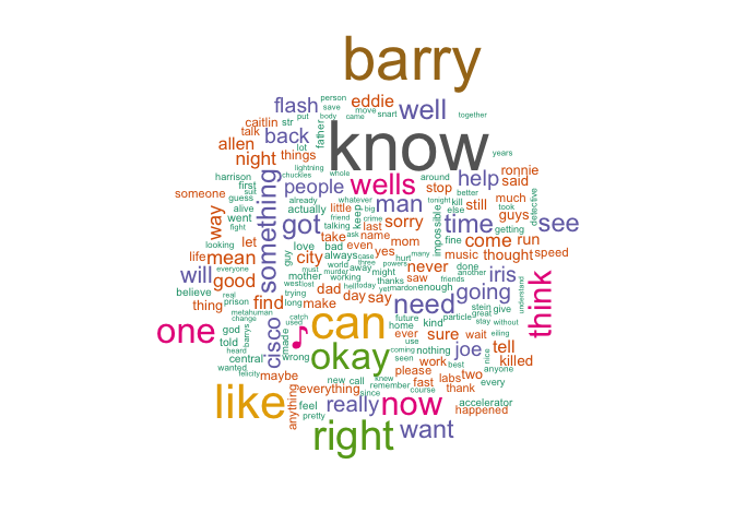
The world cloud would probably make sense to those who have watched season 1. It seems to capture the key characters, place and high-level theme. He is a speedster from the central city whose mother was killed when he was a child. He wants to go back in time, save her and make everything right. We do see this in the word cloud or it just appears to me because I have watched season 1 ☻
| Character | Relationship |
|---|---|
| Barry | Flash |
| Iris | Best friend |
| Cisco | Friend/Colleague |
| Joe | Foster father |
| Wells | Mentor/Bad guy |
| Caitlin | Friend/Colleague |
| Eddie | Iris's boyfriend |
Next, we generate word clouds using subtitles from the first three seasons. The max word count limit is set to 200. You can play around with the parameter in the R notebook
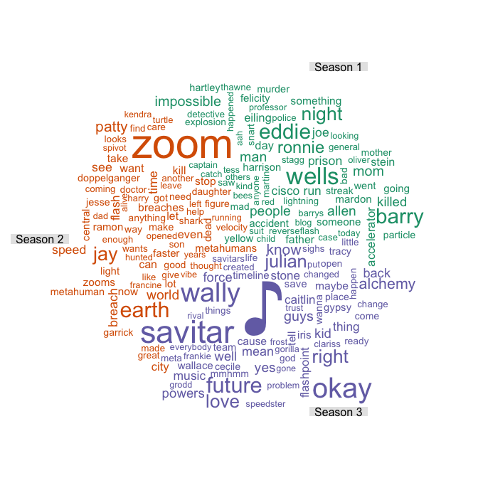
More than anything, the word cloud seems to capture the characters well. The villains win the award of most mentions. Intuitively, this makes sense because the cloud is generated from term frequency matrix and characters are probably referenced more than most words in the subtitles. In case you are wondering about ♪ in season 3, it comes from the musical crossover between the Flash and Supergirl.
Quick Sentiment Analysis
Qdap’s polarity function provides a quick and easy way to generate text sentiment. The plot below shows the average polarity of each episode per season. The score above zero is positive and below is negative. We are using the default subjectivity lexicon provided by qdap, however, it is advisable to make use of domain-specific lexicons to get better results.
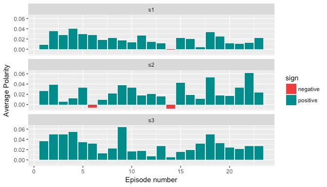
The average polarity score per episode seems to be rather low, this is because a lot of sentences do not have any polarity. A snapshot of dataframe below:
| Episode | Wordcount | Polarity | Positive | Negative | Text | |
|---|---|---|---|---|---|---|
| 10 | 1 | 6 | 0.4082483 | fastest | - | I am the fastest man alive. |
| 11 | 1 | 5 | 0.4472136 | pretty | - | - _ - My story is pretty simple. |
| 12 | 1 | 6 | 0.0000000 | - | - | My whole life, I've been running. |
| 13 | 1 | 3 | -0.5773503 | - | bullies | Usually from bullies. |
| 14 | 1 | 3 | 0.0000000 | - | - | Sometimes I escaped... |
| 15 | 1 | 4 | 0.0000000 | - | - | sometimes I did not. |
| 16 | 1 | 10 | 0.0000000 | - | - | - Tell me what happened? - Those guys were picking on kids. |
| 17 | 1 | 7 | -0.3779645 | cool | - | Just 'cause they thought they weren't cool. |
| 18 | 1 | 5 | -0.4472136 | right | - | - It wasn't right. - I know. |
| 19 | 1 | 7 | 0.7559289 | fast, enough | - | - I guess I wasn't fast enough. - No. |
| 20 | 1 | 7 | 0.3779645 | good | - | You have such a good heart, Barry. |
| 21 | 1 | 11 | 0.9045340 | better, good, fast | - | And it's better to have a good heart than fast legs. |
| 22 | 1 | 3 | 0.0000000 | - | - | Hello. I'm home. |
| 23 | 1 | 7 | 0.0000000 | - | - | - Barry got into a fight. - Oh yeah? |
| 24 | 1 | 8 | 0.3535534 | won | - | - And he won. - Ah, way to go, Slugger. |
| 25 | 1 | 2 | 0.0000000 | - | - | Oh, and... |
| 26 | 1 | 5 | 0.0000000 | - | - | no more fighting. Mh-hmm. |
| 27 | 1 | 4 | 0.0000000 | - | - | But after that night, |
| 28 | 1 | 7 | -0.3779645 | - | scarier | I was running from something much scarier. |
| 29 | 1 | 6 | 0.0000000 | - | - | - Henry! - Something I could never explain. |
| 30 | 1 | 2 | -0.7071068 | - | impossible | Something... impossible. |
Analysis using Tidy Text
In this section, we make use of Tidytext package from tidyverse. It comes with three different sentiment lexicons: BING, NRC and AFINN. These lexicons were either generated by authors themselves or via crowdsourcing and each lexicon provides a different set of capabilities.
BING Lexicon
BING provides a positive and negative score which is similar to qdap’s polarity in terms of granularity. In the plot below, we generate a stacked bar plot to compare the positive and negative score of each episode for all three seasons. The output is expected to be different from qdap’s polarity because of lexicons used as well due to the fact that qdap’s uses valence shifters to amplify positive/negative intent of the word.
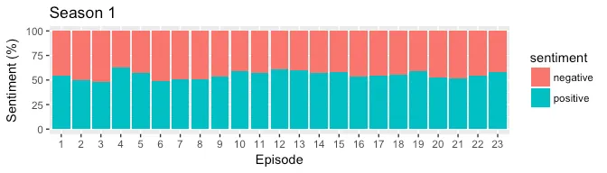
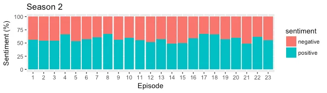
From the plots above, almost all episodes tend to contain more positive sentiment than negative. The episode 17 from season 3 seems to be the most positive which makes sense because it had a lighter tone with singing and dancing.
It would be interesting to generate a similar plot on black mirror episodes.
NRC: More than positive/negative sentiment
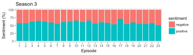
What if we wish to explore the sentiments at the granular level such as joy, anger, fear. We can make use of NRC lexicon that provides positive, negative and eight basic emotions from Plutchik’s wheel. In the plot below, we compare all three seasons against eight basic emotions.
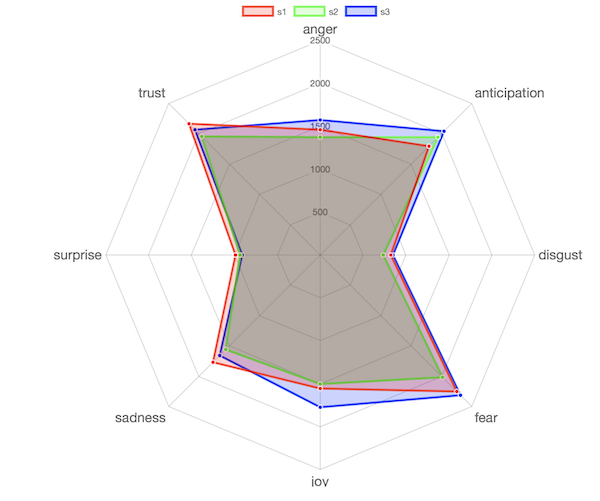
Overall, the sentiments do not vary hugely across all three seasons. To me, Season 3 was more intense of all and it is reflected in the chart.
Word Network
Next, we plot the network of words to visualize the relationship between them. This allows us to find a cluster of words if any.
co-occurring words
We count the words that co-occur together and plot the graph. The edge size represents the strength of the connection between the two words (nodes).
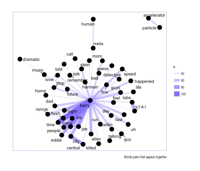
(n is the count of word pair)
We see a strong connection between the words Barry and Flash, Iris, Cisco, Allen. There aren’t many word clusters in the network except for star and labs, particle and accelerator, meta and human, dramatic and music, central and city (these are the words that appear together).
co-related words
This graph is different from above because here we are plotting the word pairs that occur most often together among all word pairs.
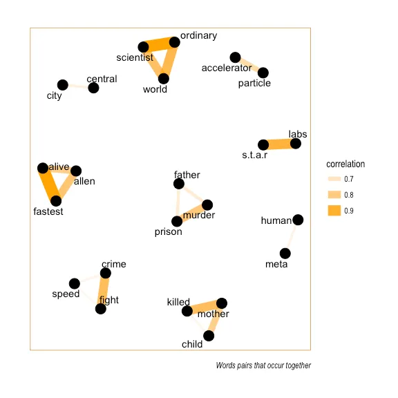
Almost all the cluster of words come from the line that Barry repeats at the start of every episode. In the future, we will explore a dataset where the word occurrence graph could be useful.
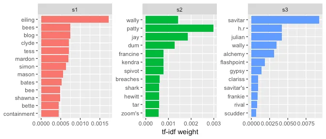
TF-IDF for season-specific relevant terms
Tf-idf Term frequency-inverse document frequency is the weighting technique that gives more weight to locally occurring words that do not occur frequently across the entire corpus. The plot below shows the top 12 words, ordered by importance, for every season.
Conclusion
The packages such as Qdap and Tidytext make it very easy to get started with text analysis in R. The plots generated here as very basic but they can be used as a starting point. To improve the accuracy on sentiment analysis, one should be looking into adding domain specific lexicons. The collection of lexicons could be a bottleneck/time-consuming task so we should also explore other means such as transfer learning of deep learning NLP models.
The source code of this post is available as R notebook on here.
If you wish to learn more about text analysis using TidyText, head over to this excellent book by Julia Silge and David Robinson
References: